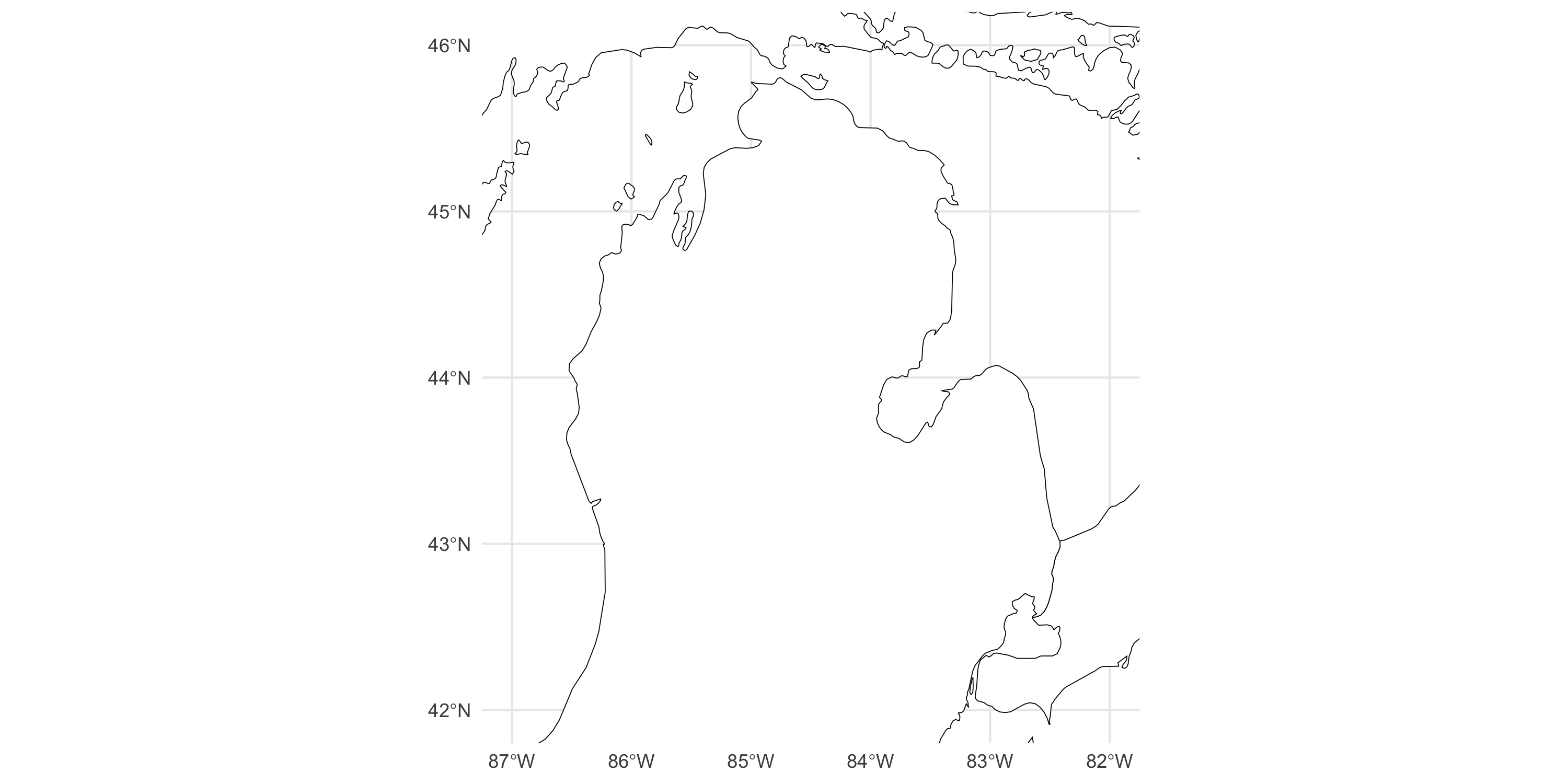
library(tidyverse)
library(sf)
library(rnaturalearth)

mainmap <- ne_states(country = c("united states of america", "canada"), returnclass = "sf")
michiganplus <- mainmap %>% dplyr::filter(name %in% c("Illinois", "Michigan", "Wisconsin", "Ontario"))

ggplot() +
geom_sf(data = michiganplus, fill = "white", color = "black") +
  coord_sf(ylim = c(42, 46), xlim = c(-87, -82)) + # reduce visualization to smaller area
theme_minimal()Types of Spatial Data
Spatial Statistics - BIOSTAT 696/896
University of Michigan
Types of spatial data
- Data with location information
- Can be visualized on a map or image
- Not limited to locations on earth
Examples:
- Climate, ecology, environment
- Disease epidemiology, environmental health
- Economic indicators, real estate
- Medical imaging (eg. BOLD activation in voxel from fMRI imaging)
- Genetics (location along chromosomes)
Three broad categories
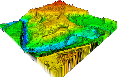
- Point-referenced data
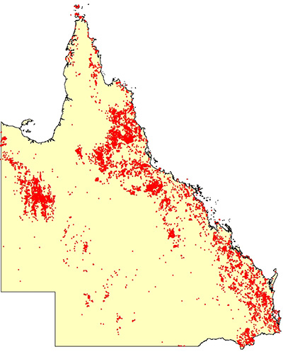
- Point pattern data
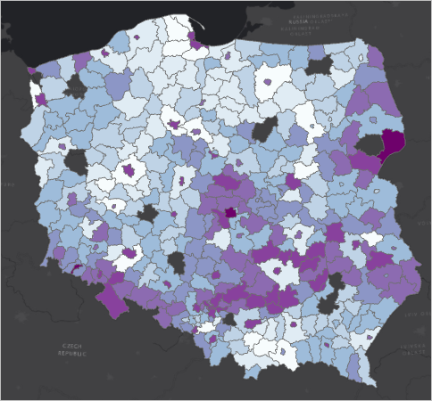
- Areal data
Common features
- We can make a map
- There is a spatial domain
- When measured on Earth, coordinates are longitude/latitude, or easting/northing
- (Careful: mapping Earth often requires choice of projection because Earth is not flat)
- More broadly, think MRI data where space is 3D, fMRI data where the space is 3D plus time
- Time is a “special” coordinate. We may cover spatiotemporal data and models later
More formally
- D \subset \Re^d spatial domain, with d=2 typically
- D itself may be complex (eg. land areas excluding water, non-urban areas, set of all roads, or river watersheds)
- Y(x) \in \Re is a spatially-indexed random variable, with x\in D
- Nature of D and thus x determines what kind of spatial data we are dealing with
Point-referenced data:
We can measure Y continuously anywhere in D
We can theoretically make an image of Y across D at any resolution
The points at which we measure x are fixed and finite in number
We may have replicated data, i.e. multiple observations at the same x. But usually, they are repeated in time, so there may be temporal dependence
Objective: learn about the infinite-dimensional surface (a function in D) based on finite number of observations. “How are things happening in space?”
Point-referenced data: example
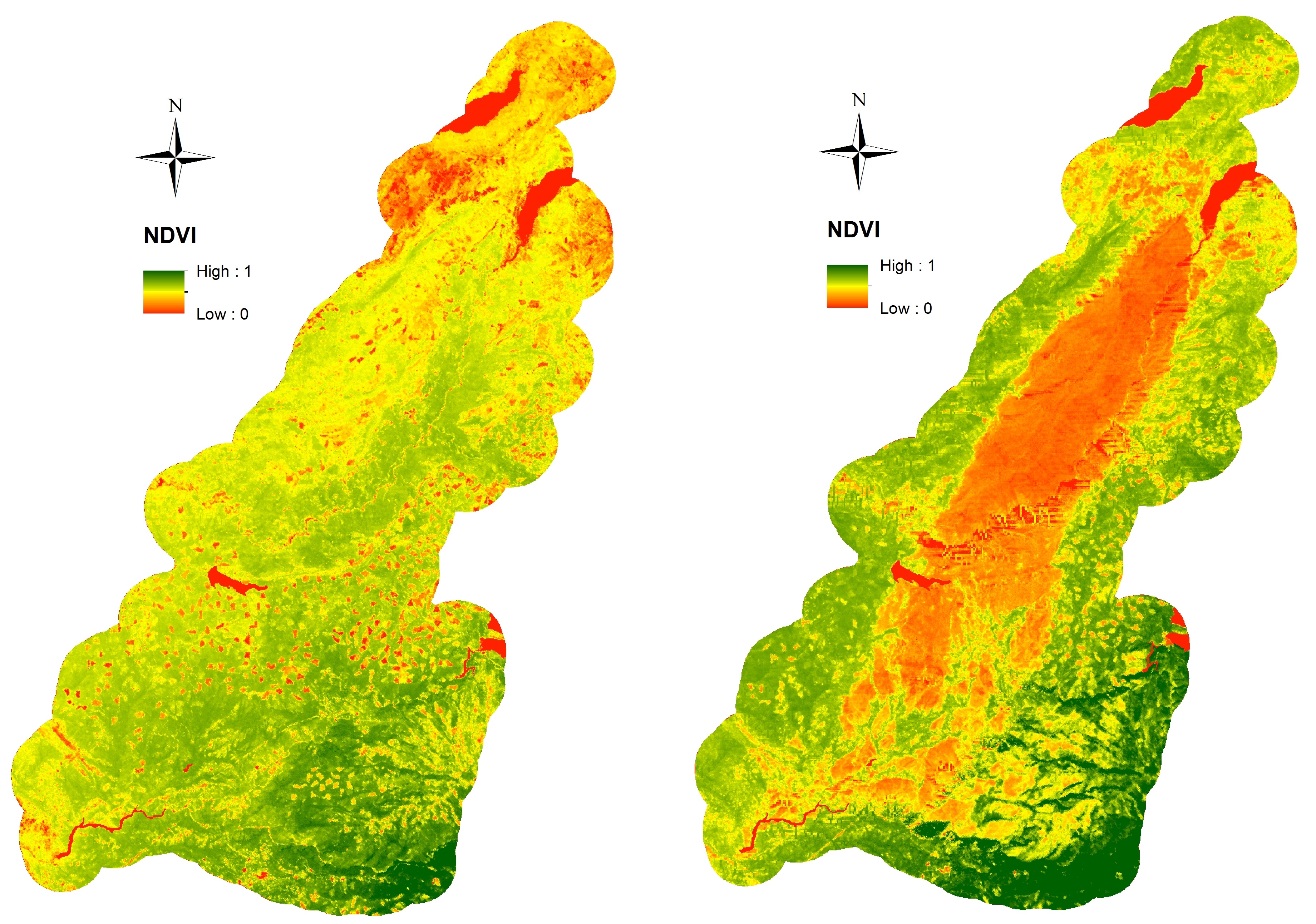
Vegetation in a region of California before (left) and after (right) a forest fire
Point-referenced data: sources
- Remote sensing, satellite imaging
- USGS https://apps.nationalmap.gov/viewer/
- R package MODIStsp
- Data.gov https://catalog.data.gov/dataset/?metadata_type=geospatial
Point-pattern data
We can measure Y continuously anywhere in D
The points at which we measure X are random and finite in number
Main interest is in learning about X itself
We may or may not be interested in Y(X): it is often just the occurrence of an event at (random) location X
Replicate data?
Objective: learn about X. “Where are things happening in space?”
Point-pattern data: example
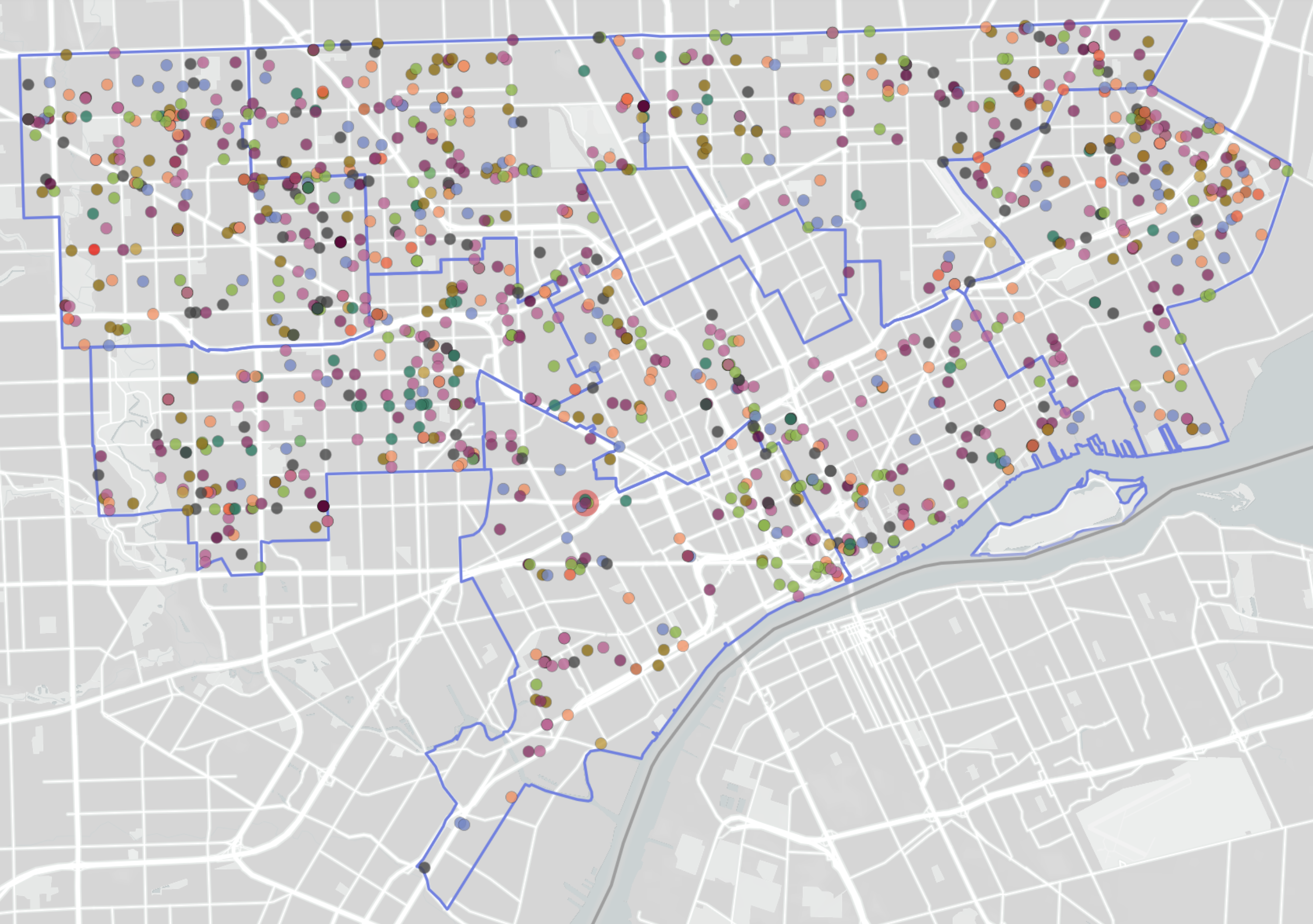
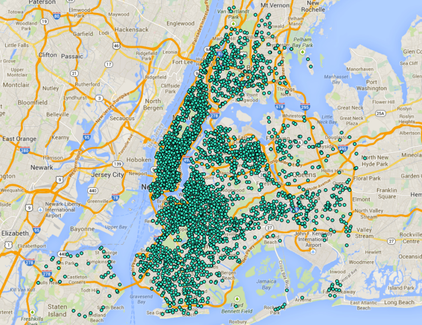
- What is the spatial domain in each case?
Point-pattern data: sources
- USGS Earthquake data https://earthquake.usgs.gov/earthquakes/feed/v1.0/csv.php
- Data.gov https://catalog.data.gov/dataset/?metadata_type=geospatial
Areal data
- Spatial domain is divided into non-intersecting regions
- D can be represented as a list of regions, or a finite set of “centroids”
- We may have replicated data, i.e. multiple observations at the same x
- Example: count of deaths by heart attack, aggregated by county
- Widely used format in public datasets, OK with privacy
- Typically obtained as an aggregate of point-reference or point-pattern data
Areal data: example
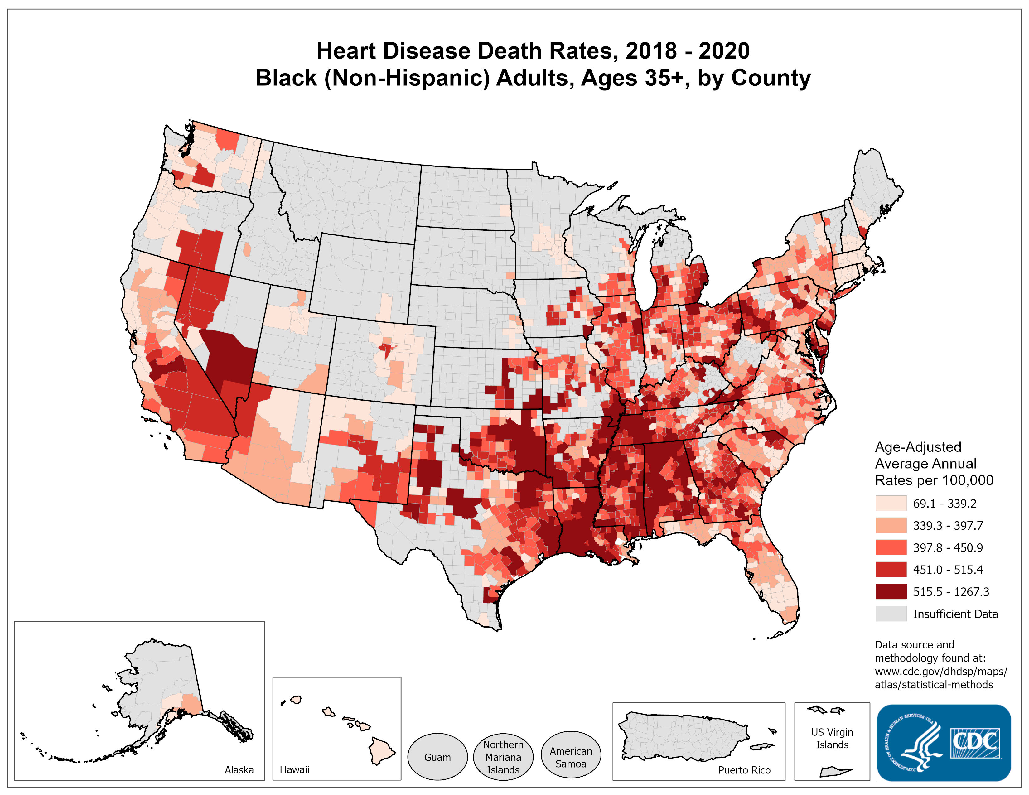
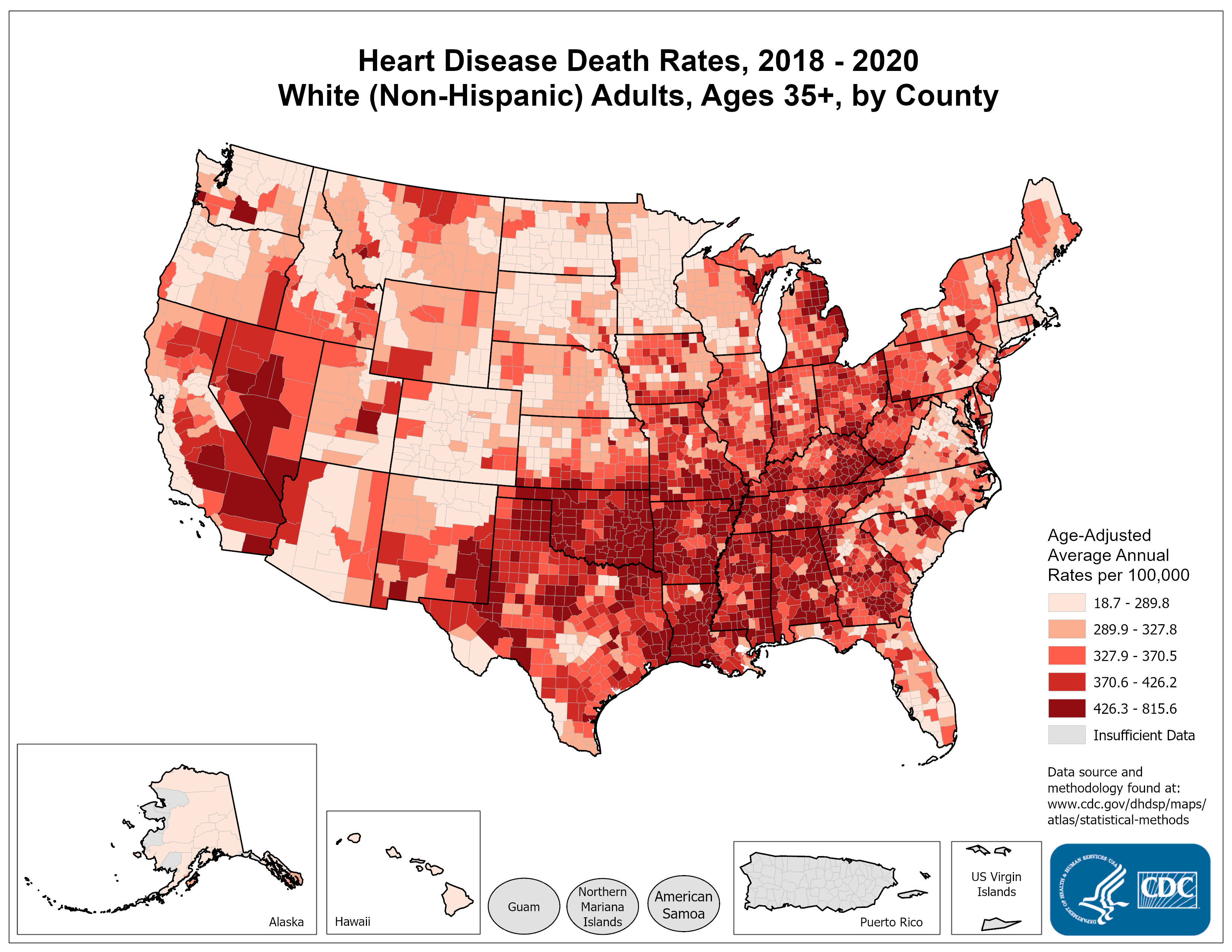
- What do you notice?
- What are some questions that these data may help address?
- Criticize this slide. Is the side-by-side clear?
Areal data: sources & contents
- US Census, CDC, World Bank…
- Huge variety of topics covered: health, economics, politics, society, environment…
Discussion
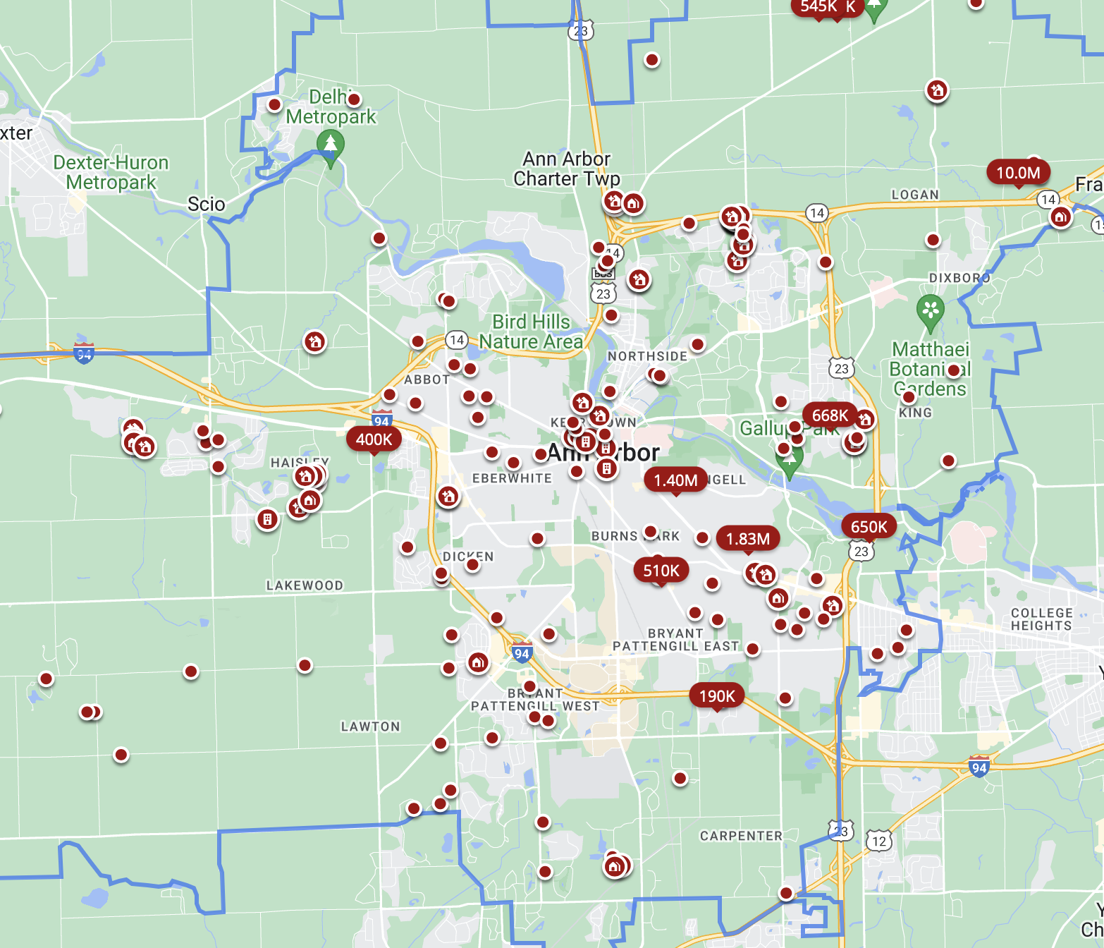
- ChatGPT says “real estate data” (e.g. location of houses for sale today) is a point pattern
- Is it really?
Discussion
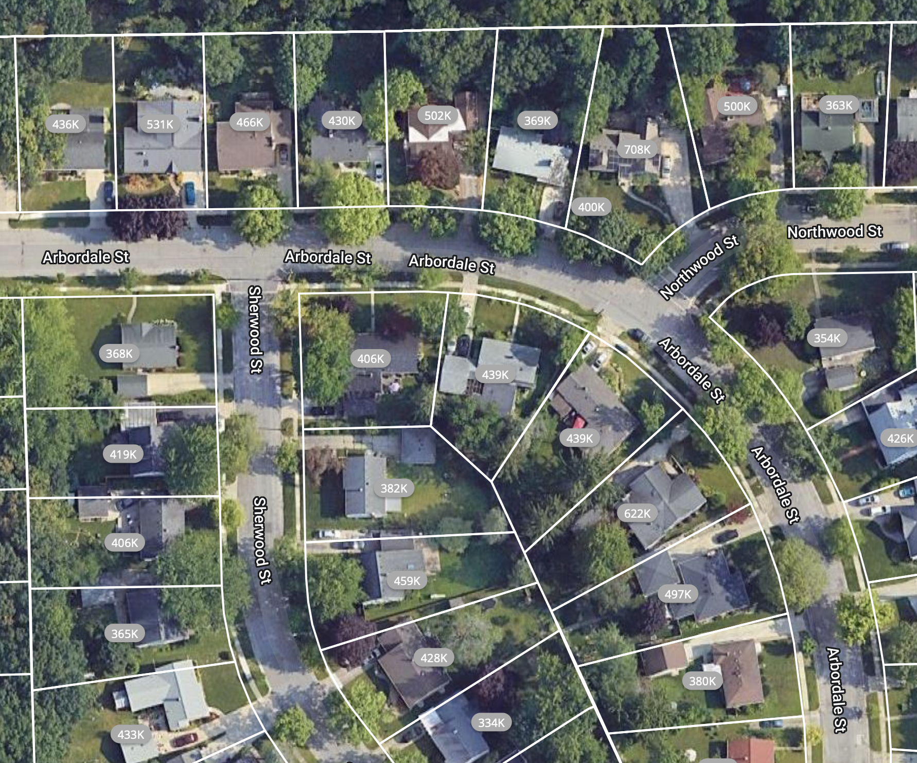
- We may treat these data as a point pattern
- But the spatial domain is the union of non-intersecting regions
- Not very clear-cut distinction
Finding spatial data
- Data.gov
- data.world
- Sometimes available in GIS/shapefile formats
- Easier to search directly for xls/csv files
When you use your own dataset:
- Submit your .csv dataset with your code (OK to zip the .csv file to reduce its size)
- OK to subsample the dataset to reduce its size (for faster computations)
- Remember to detail the preprocessing steps you use to get to a .csv file if needed
Visualization
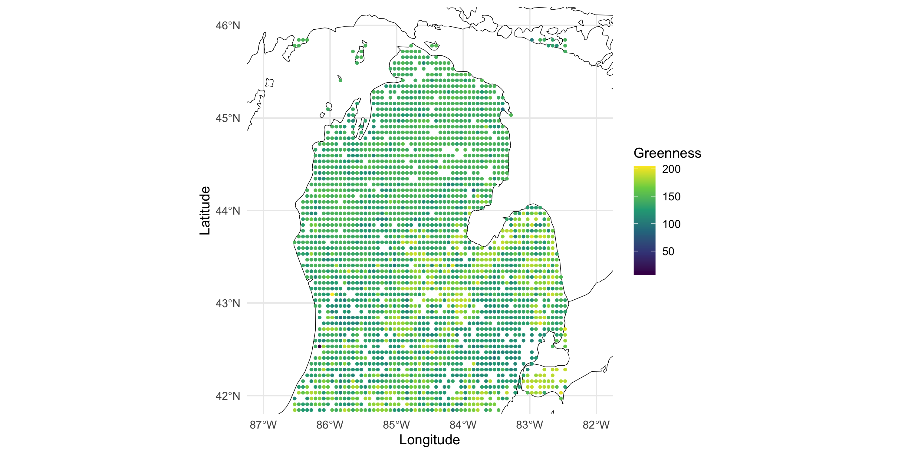
Example data: vegetation greenness over Michigan (minus UP)
Visualization
Now plot the data on top of the map
Visualization
Other variables in the same dataset: GDD (growing degree day)
colnames(df)[3:4] <- c("gdd0800", "gdd0900")

df_long <- df %>% dplyr::select(Longitude, Latitude, contains("gdd")) %>%
  tidyr::pivot_longer(cols=c(-Longitude, -Latitude), names_to = "GDD degree", values_to = "GDD value")

ggplot() +
geom_sf(data = michiganplus, fill = "white", color = "black") +
  coord_sf(ylim = c(42, 46), xlim = c(-87, -82)) +
  geom_point(data = df_long, aes(x=Longitude, y=Latitude, color=`GDD value`), size=.7) +
  scale_color_viridis_c() +
  facet_wrap(~ `GDD degree`, nrow=4) +
  theme_minimal()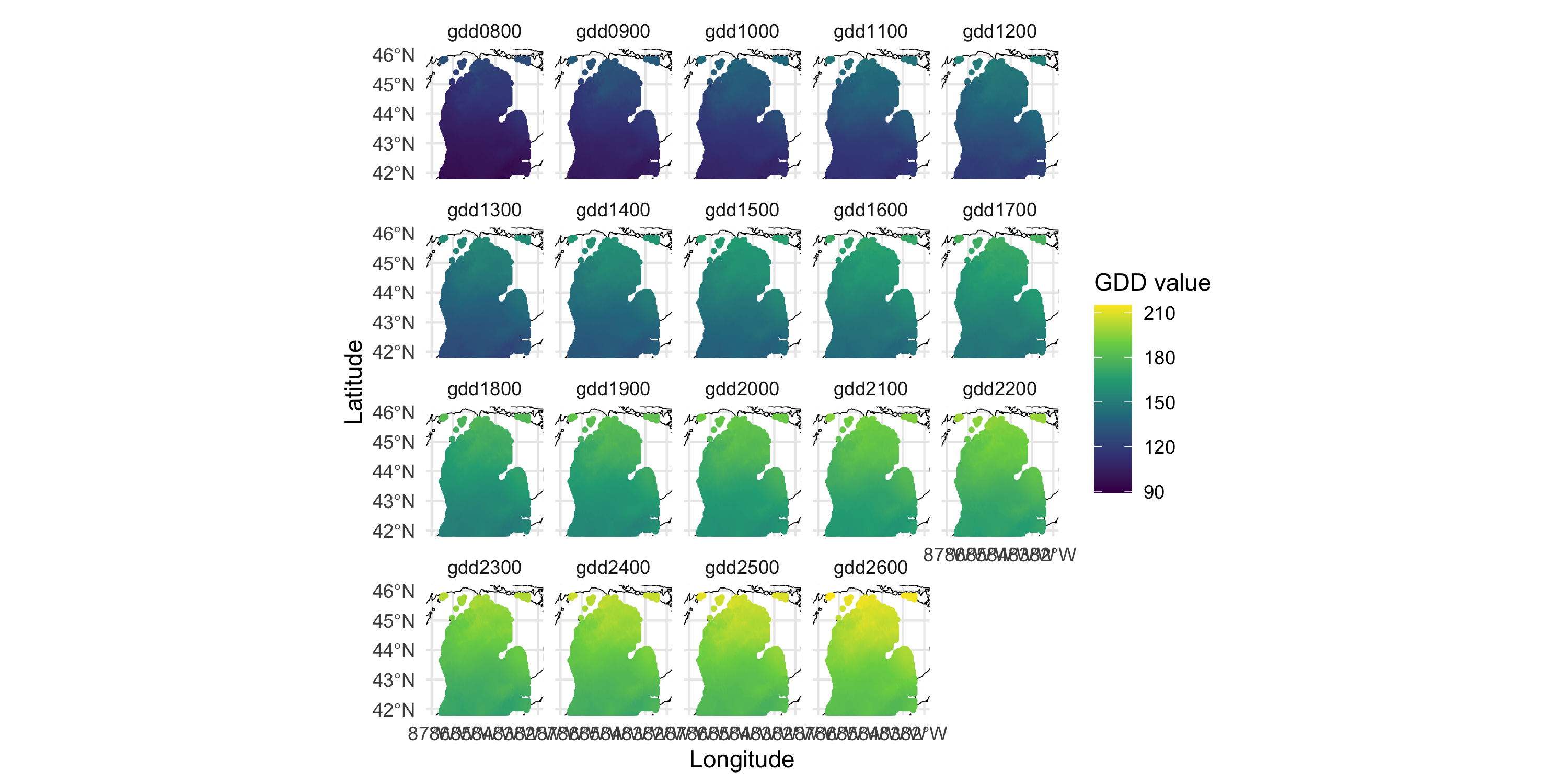
Visualization
Other variables in the same dataset: terrain forest type
                  dc_MixedForest
dc_DeciduousForest    0    1
                 0 2904   77
                 1   27    0
Same location may have multiple forest types, apparently. Therefore, must use multiple panels
df_long <- df %>% dplyr::select(Longitude, Latitude, contains("dc_")) %>%
  tidyr::pivot_longer(cols=c(-Longitude, -Latitude), names_to = "Forest type", values_to = "value") %>%
  dplyr::filter(value == 1)

ggplot() +
geom_sf(data = michiganplus, fill = "white", color = "black") +
  coord_sf(ylim = c(42, 46), xlim = c(-87, -82)) +
  geom_point(data = df_long, aes(x=Longitude, y=Latitude, color=factor(value)), size=2, shape=17) +
  scale_color_manual(values="darkgreen") +
  facet_wrap(~ `Forest type`) +
  theme_minimal() +
  theme(legend.position="none")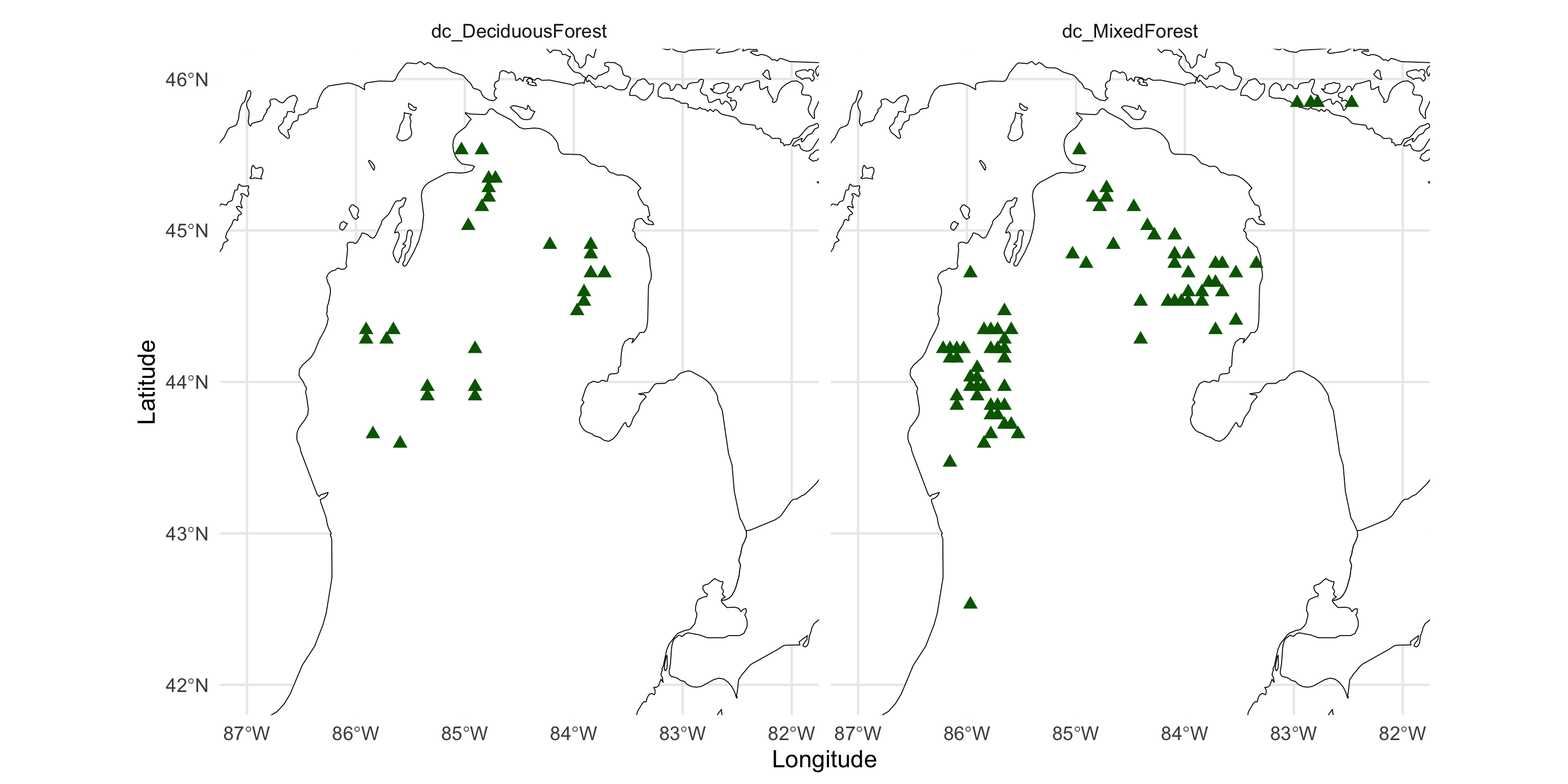
Visualization: choosing colors
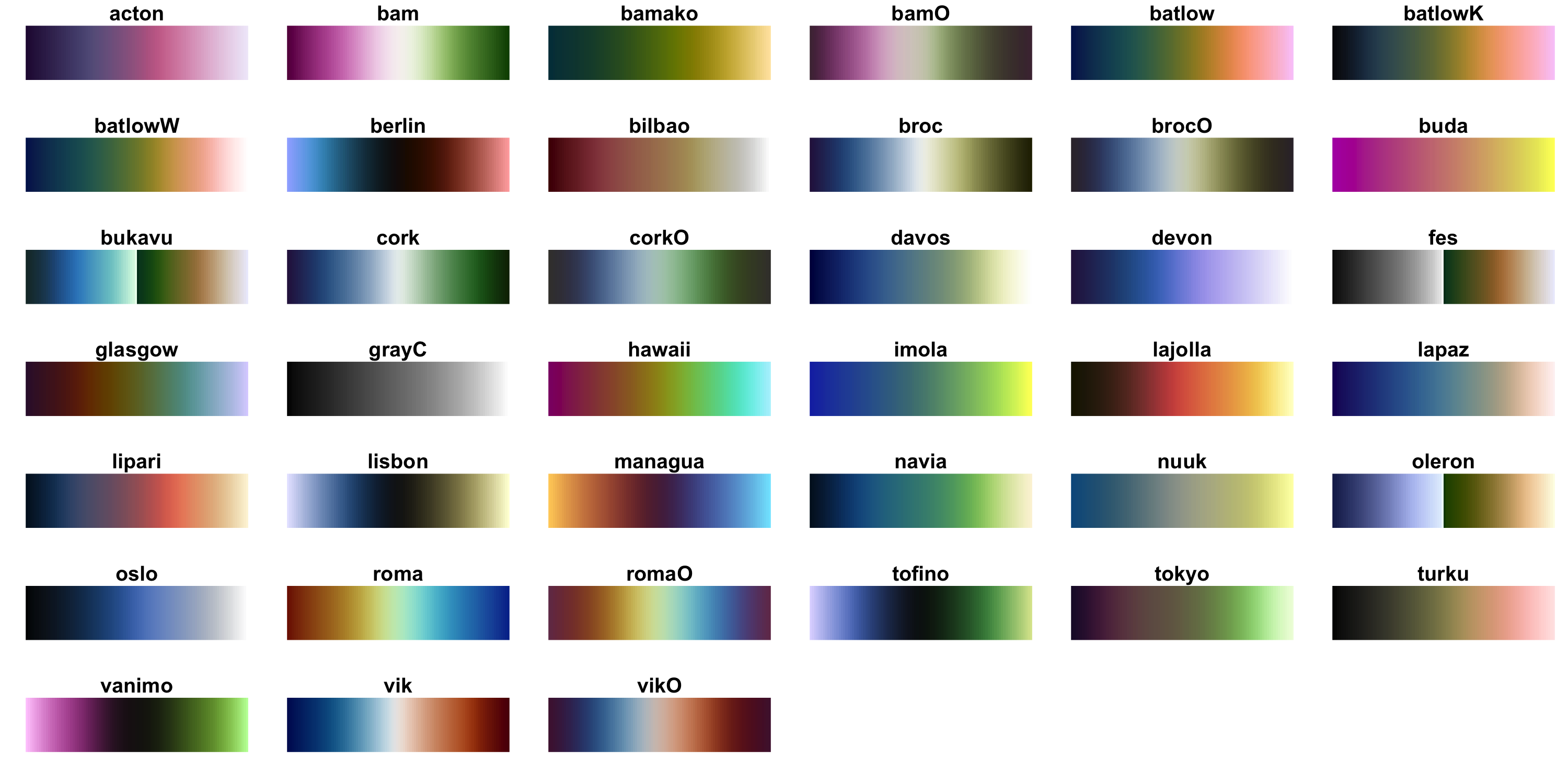
- Color scales are important for interpreting and differentiating
- Remember not everyone sees color the same way!
Visualization: choosing colors
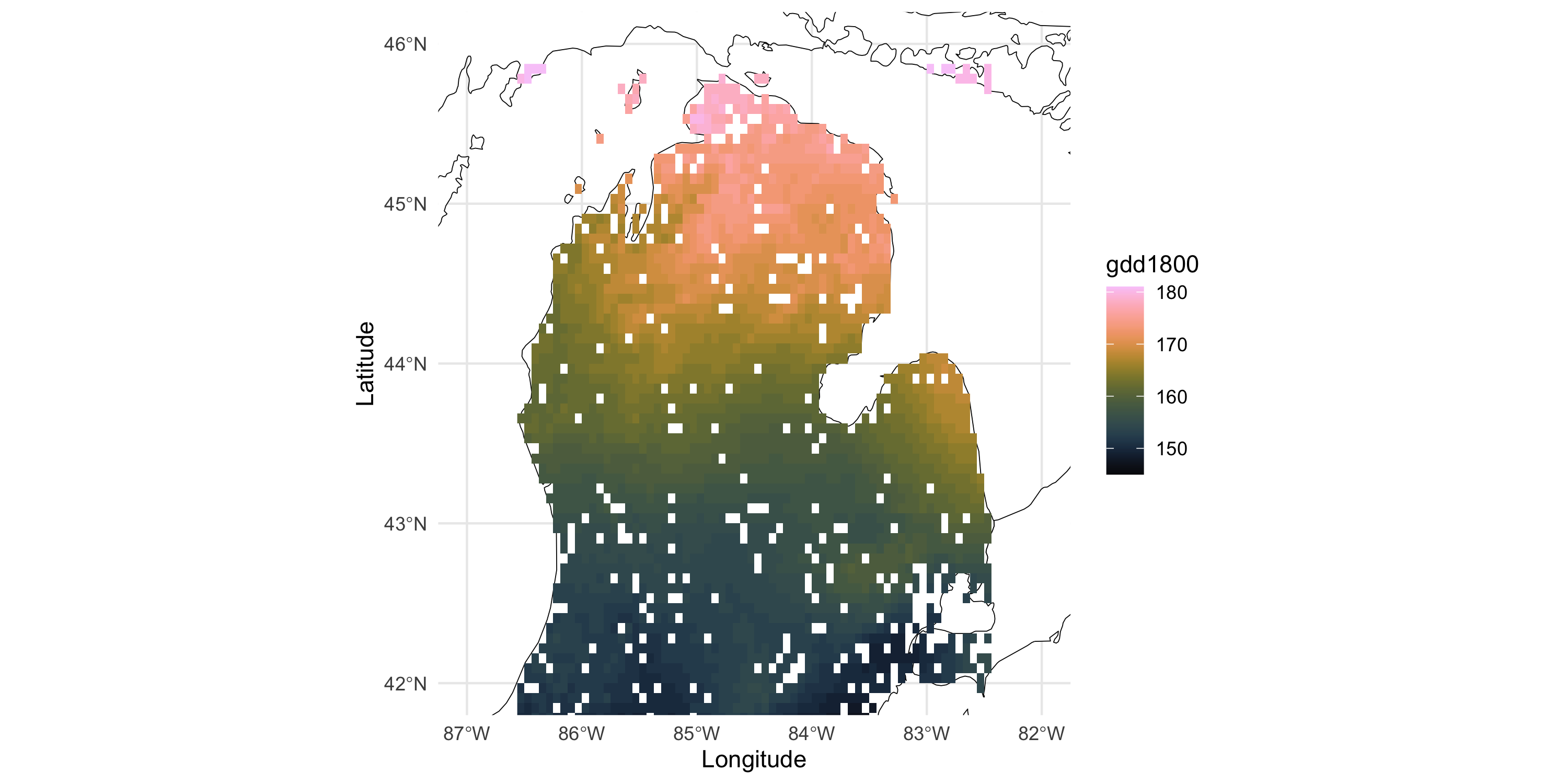
- Also, because this dataset is on a regular grid of coordinates, we can plot a raster image
- Convenient: no need to choose point size, more efficient than
geom_tile
Management and visualization of areal data
Coordinate information are likely the centroids of the county. This is areal data, not point-referenced.
  Year LocationAbbr   LocationDesc GeographicLevel DataSource
1 2019           MI  Alcona County          County       NVSS
2 2019           MI   Alger County          County       NVSS
3 2019           MI Allegan County          County       NVSS
                    Class                   Topic Data_Value
1 Cardiovascular Diseases Heart Disease Mortality      448.1
2 Cardiovascular Diseases Heart Disease Mortality      334.5
3 Cardiovascular Diseases Heart Disease Mortality      317.8
         Data_Value_Unit                                       Data_Value_Type
1 per 100,000 population Age-adjusted, Spatially Smoothed, 3-year Average Rate
2 per 100,000 population Age-adjusted, Spatially Smoothed, 3-year Average Rate
3 per 100,000 population Age-adjusted, Spatially Smoothed, 3-year Average Rate
  Data_Value_Footnote_Symbol Data_Value_Footnote StratificationCategory1
1                                                                 Gender
2                                                                 Gender
3                                                                 Gender
  Stratification1 StratificationCategory2 Stratification2 TopicID LocationID
1         Overall          Race/Ethnicity         Overall      T2      26001
2         Overall          Race/Ethnicity         Overall      T2      26003
3         Overall          Race/Ethnicity         Overall      T2      26005
     Y_lat     X_lon
1 44.68580 -83.59411
2 46.41212 -86.59408
3 42.59477 -85.90079
Management and visualization of areal data
The Stratification1 and Stratification2 columns hold covariate info in long format.
Let’s do some cleanup and focus on a portion of the Midwest US.
- We need to download county-level
sfdata, like we did earlier when plotting the state-level map.
# https://www.census.gov/geographies/mapping-files/time-series/geo/carto-boundary-file.html
counties <- sf::read_sf('data/cb_2018_us_county_500k/cb_2018_us_county_500k.shp')
head(counties)
Simple feature collection with 6 features and 9 fields
Geometry type: MULTIPOLYGON
Dimension: XY
Bounding box: xmin: -89.18251 ymin: 36.91554 xmax: -83.45285 ymax: 38.52538
Geodetic CRS: NAD83
# A tibble: 6 × 10
STATEFP COUNTYFP COUNTYNS AFFGEOID GEOID NAME LSAD ALAND AWATER
<chr> <chr> <chr> <chr> <chr> <chr> <chr> <dbl> <dbl>
1 21 007 00516850 0500000US21007 21007 Ballard 06 639387454 6.95e7
2 21 017 00516855 0500000US21017 21017 Bourbon 06 750439351 4.83e6
3 21 031 00516862 0500000US21031 21031 Butler 06 1103571974 1.39e7
4 21 065 00516879 0500000US21065 21065 Estill 06 655509930 6.52e6
5 21 069 00516881 0500000US21069 21069 Fleming 06 902727151 7.18e6
6 21 093 00516893 0500000US21093 21093 Hardin 06 1614569777 1.75e7
# ℹ 1 more variable: geometry <MULTIPOLYGON [°]>Management and visualization of areal data
- Also need a FIPS-State abbreviation table
state_fips <- tidycensus::fips_codes %>%
  dplyr::select(state, state_code) %>%
  unique() %>%
# call the columns with the names they have in the respective datasets
  dplyr::rename(STATEFP = state_code, LocationAbbr = state)

counties <- counties %>%
  left_join(state_fips) %>%
  dplyr::rename(LocationDesc = NAME)
Make into sf object and plot the map
df_local <- df %>%
  left_join(counties, by = c("LocationAbbr", "LocationDesc")) %>%
  st_as_sf()

ggplot(data=df_local %>%
         dplyr::filter(Stratification1 == "Overall", Stratification2 == "Overall")) +
  geom_sf(aes(fill=Data_Value)) +
  theme_minimal() +
  labs(fill = "Heart disease per 100k pop") +
  scale_fill_viridis_c()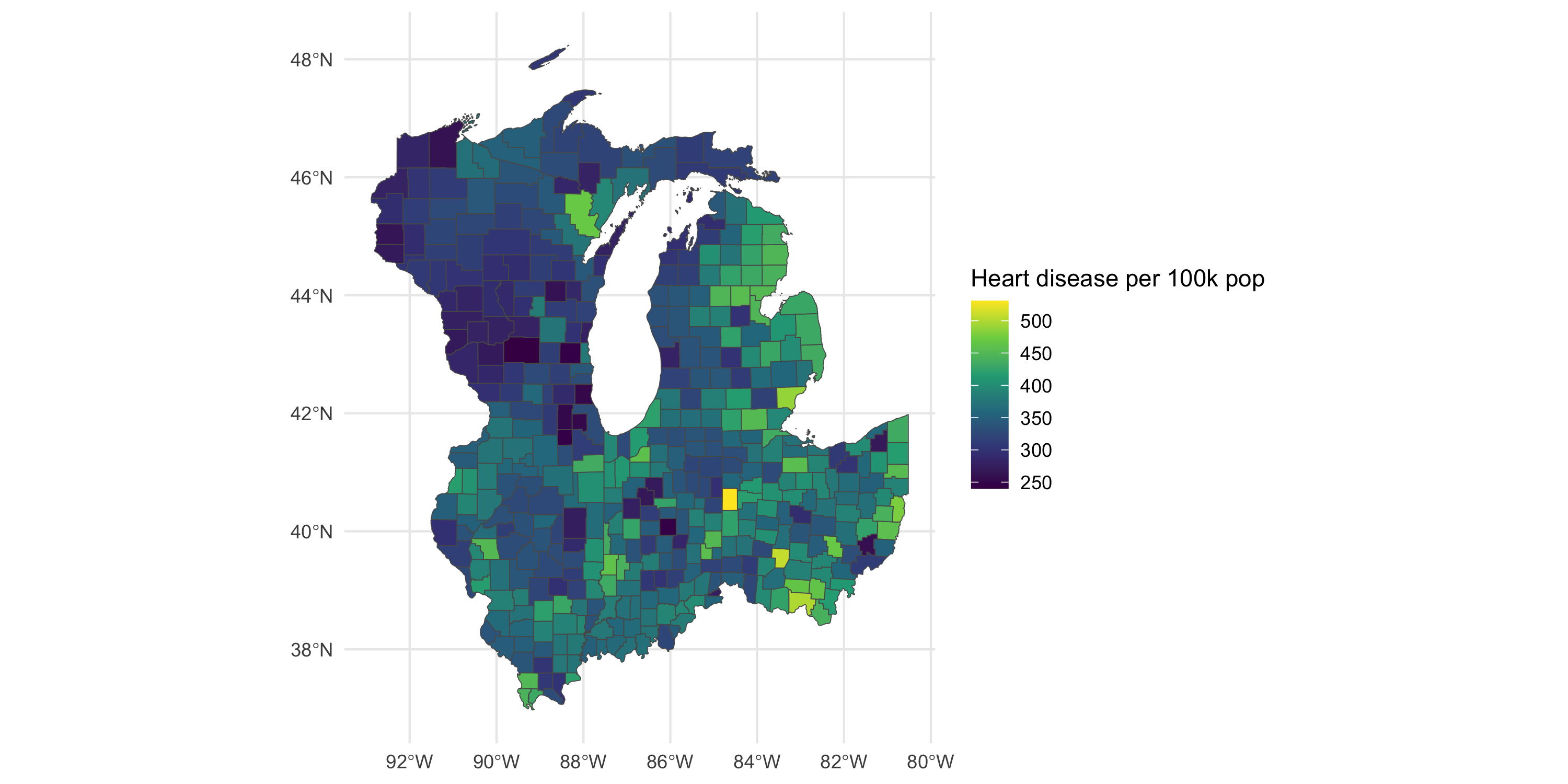
Management and visualization of areal data
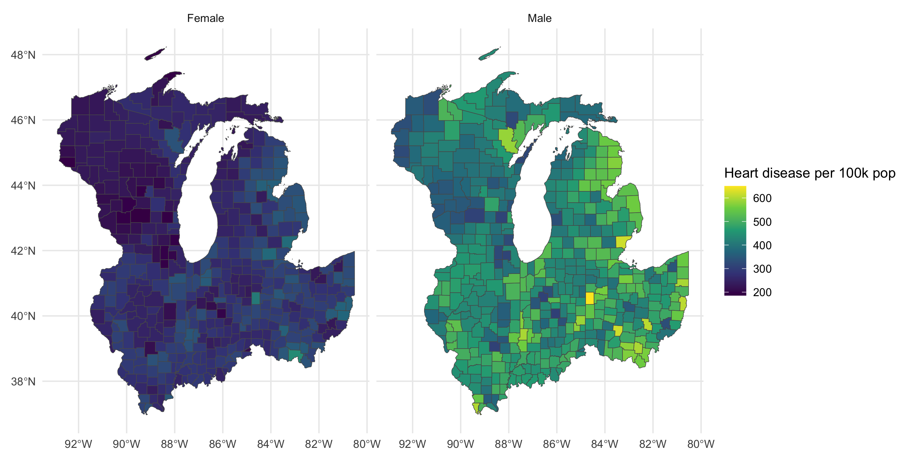
Plot map by gender
Management and visualization of areal data
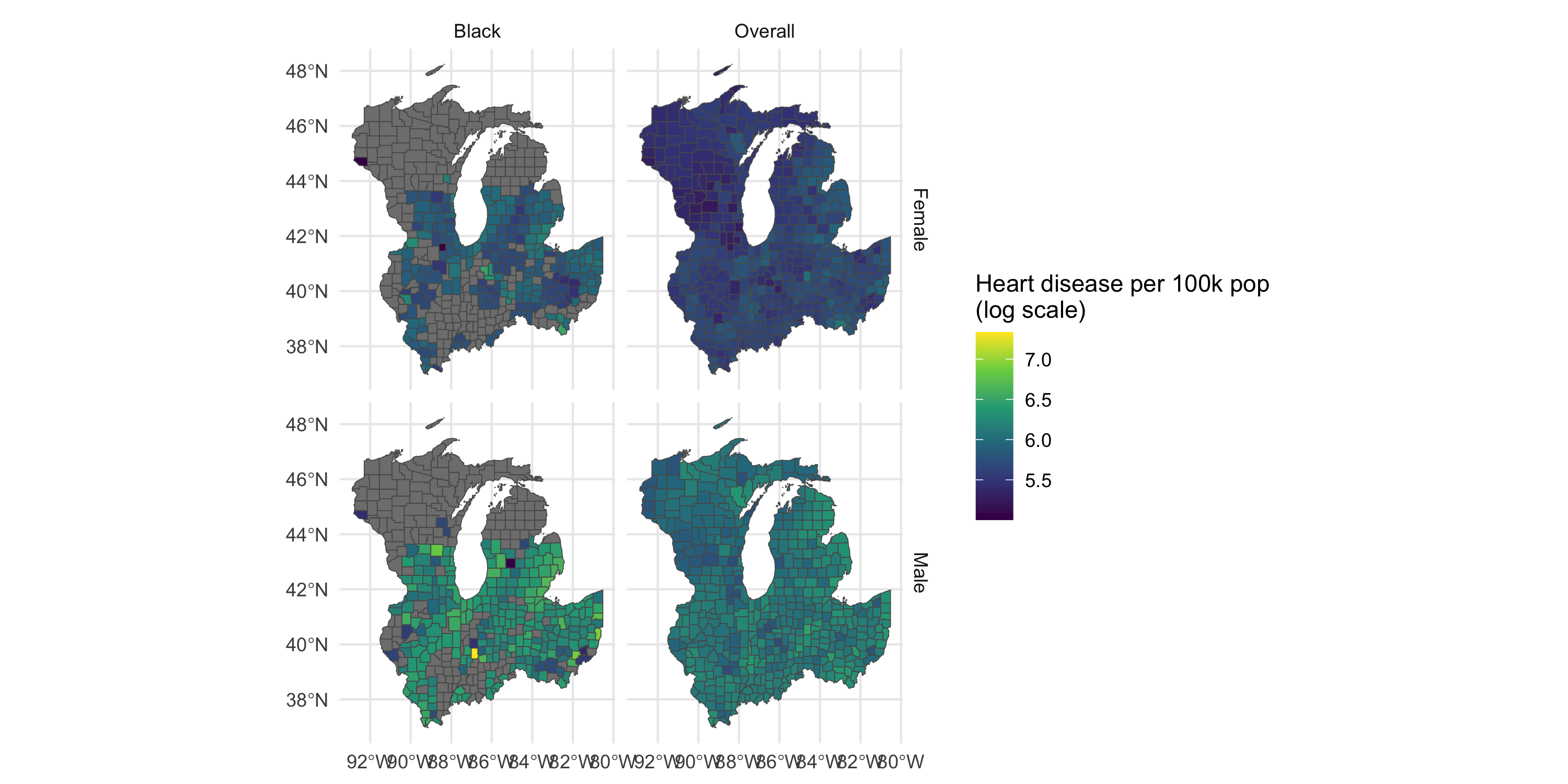
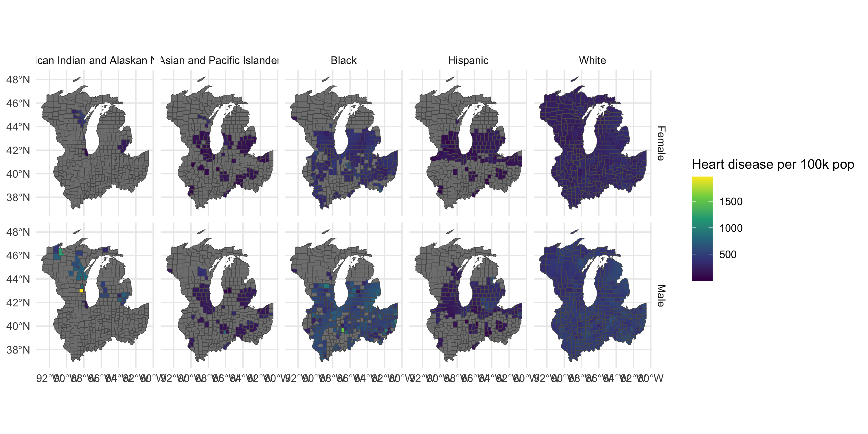
Plot map by gender and race/ethnicity
Management and visualization of areal data
Restrict and transform
